Compose-2030 Creating Plots in OML
- Creating a plot.
- Creating a subplot.
- Get/Set the figure/axes/curve/text properties.
- Adding data into a plot.
- More 2D plot types.
- More 3D plot types.
- Using utility commands.
- Interacting with UI.
More details on each function used in this tutorial can be found in the Function Reference Guide.
Creating a Plot
In OML, data can be visualized in various forms by plotting commands, such as plot, bar, polar, surface, contour, and so on. The simplest and most-used command is plot, which creates a line plot based on the given data.
-
Create a line plot on some random data:
plot(rand(1,10));
-
Create multiple lines on multiple sets of data:
x=[0:0.1:3*pi];
plot(x, sin(x), x, cos(x));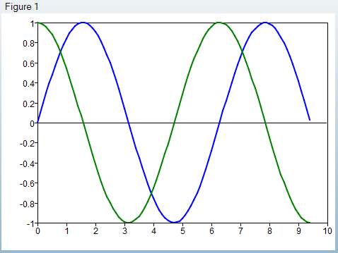
-
Controlling the line style with a format string, the sine curve is specified as
the red dotted line, and cosine is specified as scattered star marker:
x=[0:0.1:3*pi];
plot(x, sin(x), 'r:', x, cos(x), '*');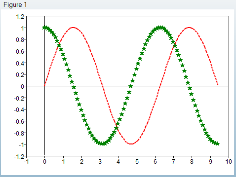
-
Controlling the line style with a property/value pair, the width of the sine
curve is set as 3, and the cosine curve is specified as a dashed line:
x=[0:0.1:3*pi];
plot(x, sin(x), 'linewidth', 3, x, cos(x), 'linestyle', '--');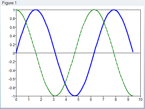
Please refer to the chapter, for bar, polar, surf and other plotting commands.
Create a Subplot
It’s useful to create a grid of plots in a single figure to compare the curves. This can be done using the commandsubplot().
-
Create grids of plots by 2 rows and 3 columns, with the 4th entry
set as the active axes, count from left to right, up to down:
subplot(2, 3, 4);
-
Create grids of plots by the simplified form of subplot,
using a 3-digit number to specify the row number (in this example, 2), column
number (3) and the active entry (6):
subplot(236)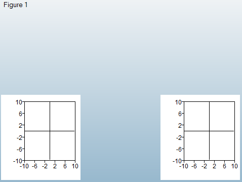
Get and Set the Figure, Axes, Curve, and Text Properties
Each plotting item in OML, such as the figure, axes, curve, and text, are graphic objects, which have handles and properties associated with them. Use the command get() to query the properties and set() to change them.
-
Getting the properties of a figure, the figure handle is a positive integer:
fHandle = figure()
get(fHandle)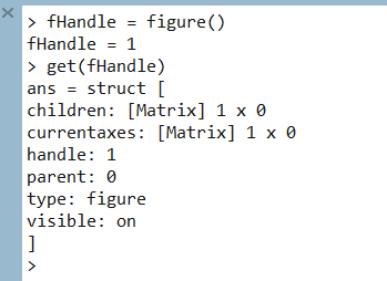
-
Get the specified properties of an axes by passing get() a
second parameter, for example, the property name:
get(aHandle, 'visible')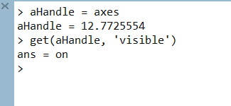
-
Use set() to change the property of graphics objects. For
example, change the line color to red:
lineHandle = plot(rand(1,10));
get(lineHandle, 'color')
set(lineHandle, 'color', 'r')
get(lineHandle, 'color')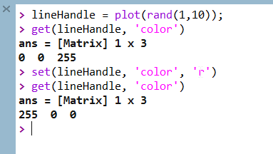
Add Data into a Plot
By default, running each plotting command replaces data in the current axes, and this behavior can be changed by calling the hold() command. This command toggles/changes the “hold” state of current axes, and if turned on, plotting commands add data, instead of replace, in the current axes. Hold() takes ‘on’ or ‘off’ as an argument, to turn on or off the “hold” state of the current axes. It can be called without an argument also. In this case, it’ll toggle the state.
-
By turning hold() on, the cosine curve is added beside the
sine curve, instead of replacing it:
x=[0:0.1:3*pi];
plot(x, sin(x));
hold on;
plot(x, cos(x));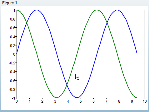
More 2D Plot Types
Besides the plot() command, more 2D plot commands can be used to visualize 2D data, including: line(), bar(), scatter(), area(), polar(), fill(), hist(), loglog(), semilogx(), semilogy(), and contour().
-
Similar to plot(), line() can be used to
draw lines. The difference between them is line() always
inserts a line into the current axes, no matter what the current hold state is,
and plot() replaces the current lines if the current hold
state is off. Compare the following example with the previous step, Add Data
into a Plot:
x=[0:0.1:3*pi];
plot(x, sin(x));
line(x, cos(x));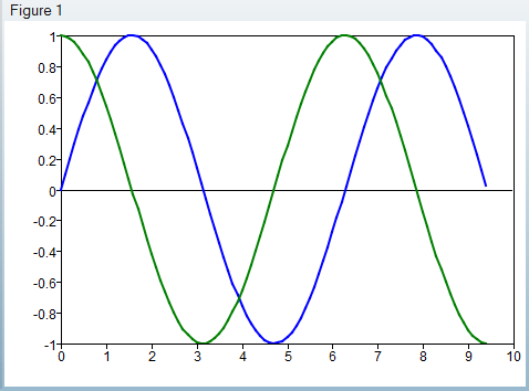
-
Bar(), as its name implies, creates a bar plot from 2D data:
x=[-2:2];
y=[2 4 3 1 5;2 3 4 5 1; 3 4 2 5 4];
subplot(121);
bar(x,y);
title('grouped bar plot');
subplot(122);
bar(x,y,'stacked');
title('stacked bar plot');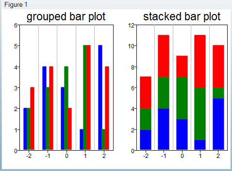
-
Scatter() creates a 2D scatter plot:
x=rand(100,1);
y=rand(100,1);
scatter(x,y);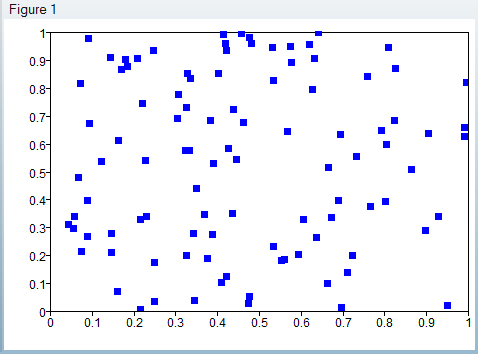
-
Area() creates a stacked-areas plot:
x = [1:5];
y = [x',x',x'];
area(x,y);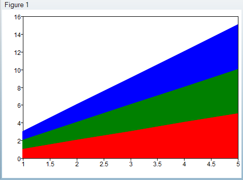
-
Polar() draws a curve with phase and magnitude in polar
coordinates:
t = [0:0.01:2*pi]
r = sin(2*t).*cos(2*t)
polar(t,r)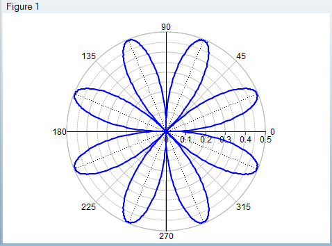
-
Fill() creates filled 2D polygons:
t1 = (1/16:1/8:1) * 2*pi;
t2 = ((1/16:1/8:1) + 1/32) * 2*pi;
x1 = tan (t1) - 0.8;
y1 = sin (t1);
x2 = tan (t2) + 0.8;
y2 = cos (t2);
h = fill (x1,y1,'r', x2,y2,'g')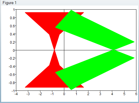
-
Hist() creates a histogram:
d=normrnd(5,2,1,1000);
hist(d);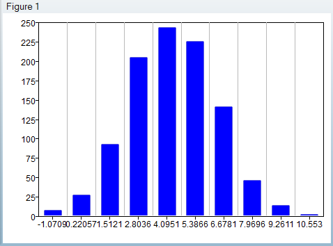
-
Loglog() plots a given dataset in 2D with logarithmic scales
for x and y axes:
y=logspace(1,10,10);
loglog(y)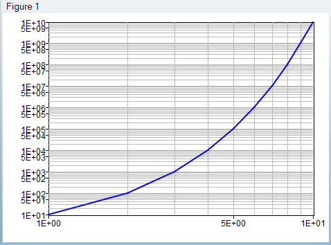
-
Semilogx() plots a given dataset in 2D with logarithmic
scales for the x axes, compared to the previous example:
y=logspace(1,10,10);
semilogx(y)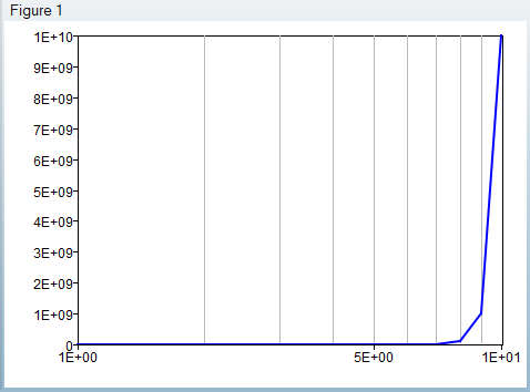
-
Semilogy() plots a given dataset in 2D with logarithmic
scales for the y axes, compared to previous example:
y=logspace(1,10,10);
semilogy(y)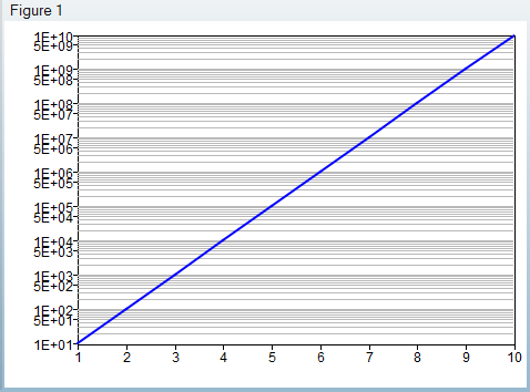
-
Contour() creates a 2D contour plot:
x=[0:0.1:2*pi];
y=x;
z=sin(x')*cos(y);
contour(x, y, z)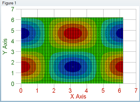
3D Plot Types
Besides the 2D plotting commands, 3D plot commands can be used to visualize 3D data, including: plot3(), scatter3(), surf(), mesh(), waterfall(), and contour3().
-
Similar with plot(), plot3() creates a 3D
line plot:
u = [0:(pi/50):(2*pi)]
x = sin(2*u).*(10.0 + 6*cos(3*u))
y = cos(2*u).*(10.0 + 6*cos(3*u))
z = 6*sin(3*u)
plot3(x,y,z)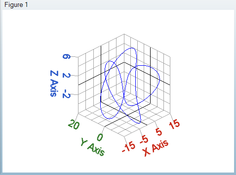
-
Similar with scatter(), scatter3()
creates a 3D scatter plot:
u = [0:(pi/50):(2*pi)]
x = sin(2*u).*(10.0 + 6*cos(3*u))
y = cos(2*u).*(10.0 + 6*cos(3*u))
z = 6*sin(3*u)
scatter3 (x,y,z)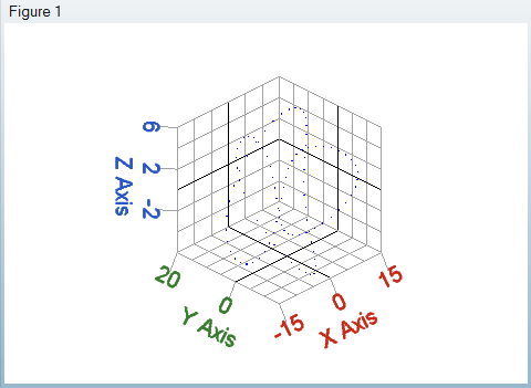
-
Surf() creates a 3D surface:
x=[0:0.1:2*pi];
y=x;
z=sin(x')*cos(y);
surf(x, y, z);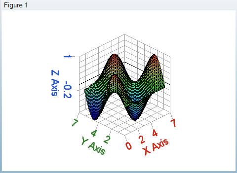
-
Mesh() creates a 3D mesh:
x=linspace(1,10,10);
y=x;
z=x'*y;
mesh(x, y, z);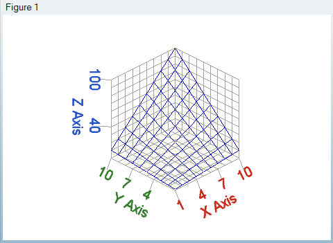
-
Waterfall() creates a waterfall surface:
x=[0:0.1:2*pi];
y=x;
z=sin(x')*cos(y);
s=waterfall(z)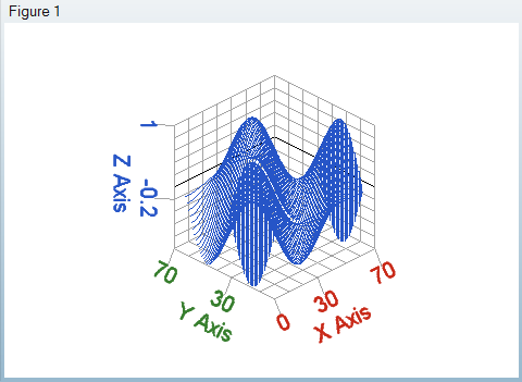
-
Similar to contour(), contour3() creates
a 3D contour plot:
x=[0:0.1:2*pi];
y=x;
z=sin(x')*cos(y);
contour3(x,y,z)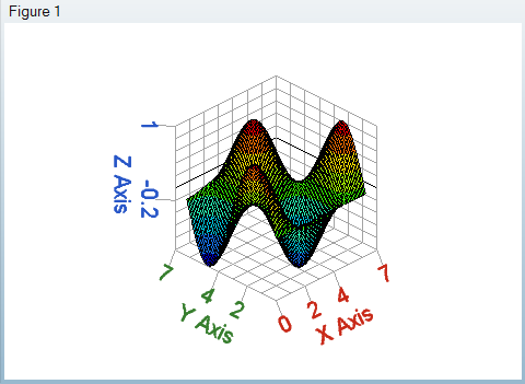
Plot Utility Commands
- gcf() returns current figure handle; clf() returns current figure.
- gca() returns current axes handle; cla() returns current axes.
- close() closes the current figure; close('all') closes all figures.
- ishandle() takes a number or variable and judges whether it is a handle; isfigure() takes a number or variable and judges whether it is a figure handle; isaxes() takes a number or variable and judges whether it is axes handle.
- grid() turns on/off the grids of an
axes:
x=[0:0.1:3*pi];
plot(x, sin(x));
grid;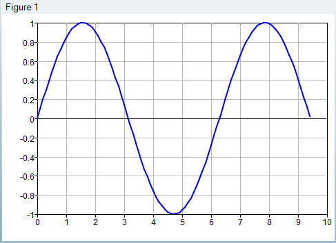
- legend() turns on/off the legend of an axes. With string
arguments, legend() updates the legend of each
curve:
x=[0:0.1:3*pi];
plot(x, sin(x), x, cos(x));
legend('sin(x)', 'cos(x)');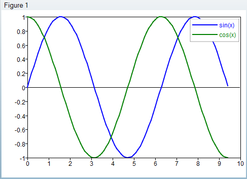
- title(), xlable(),
ylabel(), zlabel() can be used to
updated corresponding
text:
x=[0:0.1:3*pi];
plot(x, sin(x), x, cos(x));
title('sin&cos curves');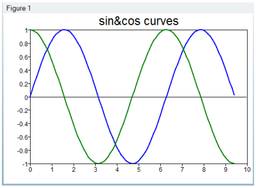
- axis() can be used to set axis limits. When called
without an argument, it turns on the auto-scaling of the current axes and
returns the current axes
limits:
x=[0:0.1:3*pi];
plot(x, sin(x), x, cos(x));
axis([0 15 -2 2]);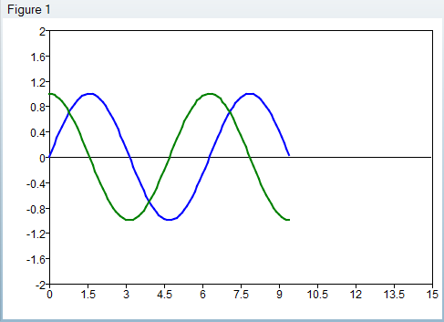
- text() inserts some text in the axes on a specified
location:
x=[0:0.1:3*pi];
plot(x, sin(x), x, cos(x));
text(pi/2, 1,'hello');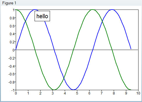
Interacting with the User Interface
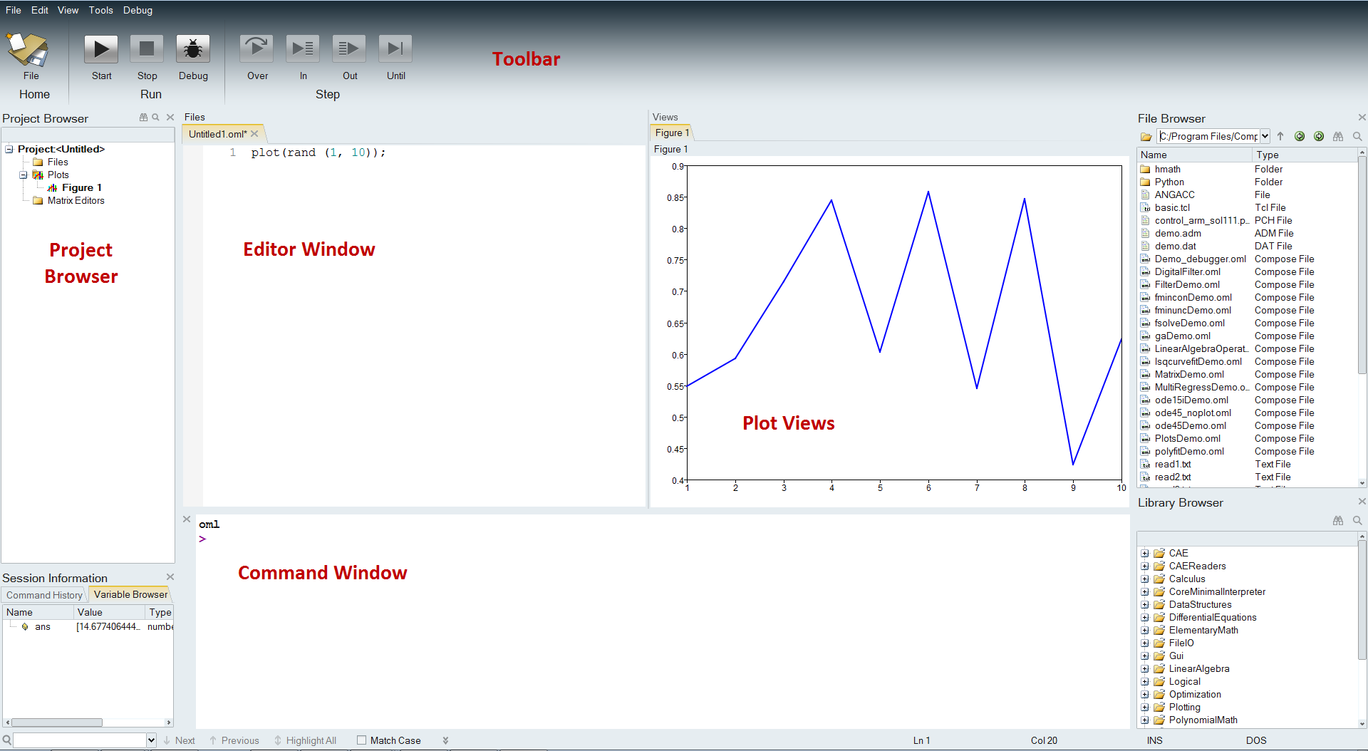
Creating and handling plots is introduced in tutorial Compose-1000. The Compose application allows you to manipulate plots in the plot view (to interactively change plot properties) but also in the Project Browser to manage plot objects and add/remove them to/from projects.
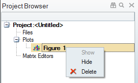
- Plots created by a script can be shown, hidden, or deleted.
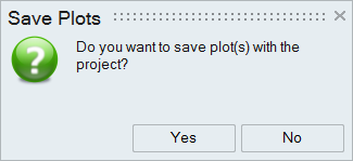
- You can choose files and plots to be saved in a project file. Plots are
added into a project automatically when created, and it will prompt whether
plots should be saved in the project file or not when you save the project.
To save the project, select and select a location for the project file. You are prompted
to answer if plots must be added to the project.
From the Plot View mode:
In plot view, you can interact and manipulate the plot using the following methods:
- Ctrl + Mouse left button dragging: Pan the plot.
- Mouse wheel rolling up/down: Zoom in/out the plot.
- If the mouse is on the X (resp. Y) axis, it will only zoom on the X (resp. Y) axis.
- Middle mouse button (mouse wheel) click: Reset plot view.
- Middle mouse button (mouse wheel) dragging: Circle zoom in plot.
- Ctrl + Middle mouse button (mouse wheel) dragging: Box zoom in plot.
- Mouse right-button click: Displays specific panel (see below).
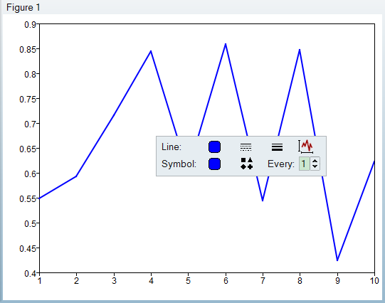
In the plot view, you can access properties of each area by right-clicking on an element of plot, such as the curve, axes, legend, title, background, an so on.
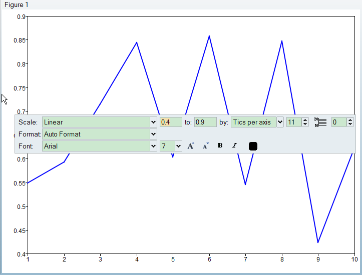
The dialogs are dismissed by clicking elsewhere in the plot view. Here are some examples of the properties dialogs.
Curve style dialog:
Axis Style dialog: